
Biology
Stop trusting a beautiful graph. Start challenging the evidence.
Don't mistake a smooth trend line for a sound biological conclusion. An A-Level Biology method for analysing practical data, controls, replicates, uncertainty and enzyme-rate graphs.
By Finesse Tuition · · 8 min read
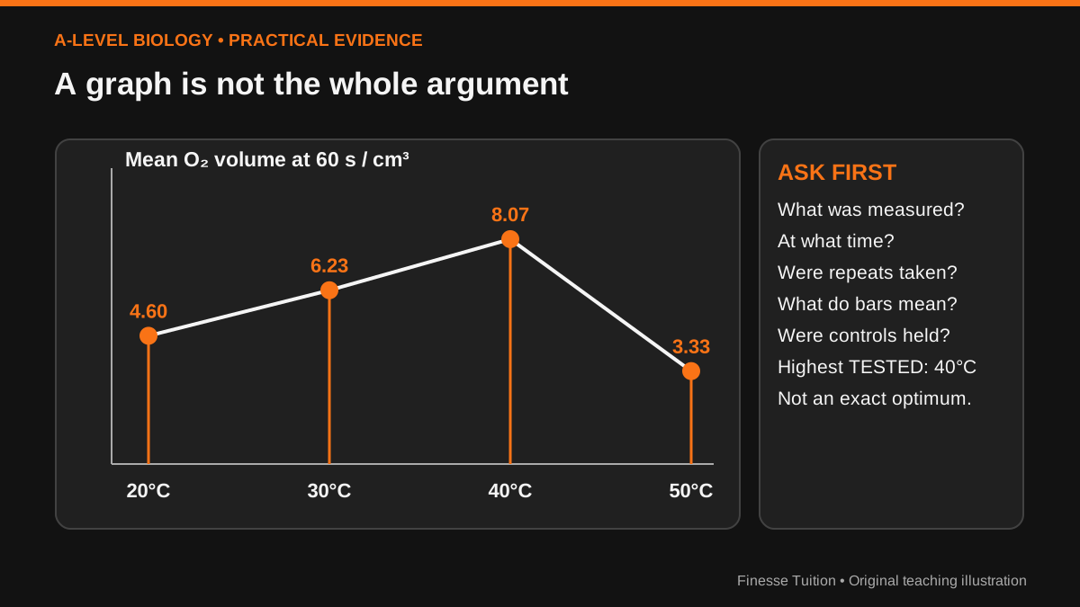
The curve looks convincing. Is the experiment?
Most students can describe a rising line. Far fewer can tell you what the line fails to show. An impressive graph of a biological experiment may be based on three samples, a changing control variable or an imprecise instrument. Reproducing the textbook explanation then misses the point: an examination question is asking whether the evidence warrants that explanation.
Your new habit is to read every unfamiliar graph in four passes. First inspect the axes and units. Second describe the numerical pattern without inserting a cause. Third check the design, replicates and uncertainty. Only then write a biological explanation and an honest limitation. This is not an invitation to be sceptical of everything; it is how careful biological reasoning works.
The method is especially relevant to AQA A-Level Biology (7402). The official practical-assessment specification states that at least 15% of written A-Level marks assess practical skills such as evaluating methods, drawing conclusions with reference to uncertainties, processing data, plotting graphs and identifying controlled variables. Similar principles apply across other boards, but use the appropriate board's actual mark schemes.
Our example: catalase and oxygen production
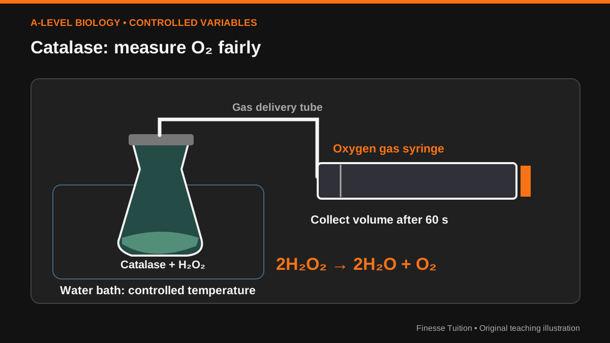
Consider catalase catalysing the decomposition of hydrogen peroxide: 2H₂O₂ → 2H₂O + O₂. A teacher wants to investigate how temperature affects the reaction. A class uses an enzyme preparation with fixed concentration and volume, a fixed hydrogen peroxide concentration and volume, a controlled pH, identical collection apparatus and the same measurement time. It collects the volume of oxygen in a gas syringe after 60 seconds.
Temperature is the independent variable; oxygen volume at 60 seconds is the measured dependent variable. Keep enzyme source/concentration, substrate supply, pH, solution volume, apparatus, mixing and timing as consistent as possible. Equilibrating the solutions to the target temperature before mixing makes it more credible that the reaction actually occurred near the labelled temperature.
Safety and technique matter in school practicals: handle hydrogen peroxide and laboratory glassware under your teacher's supervision. The illustrations here explain how to assess data; they are not a replacement for an approved laboratory method. None of the numbers that follow came from a real school or published research: they are an explicitly illustrative dataset.
How to read a graph without inventing a story
Pass one: check the axes. Is the x-axis temperature in °C? Is the y-axis oxygen volume in cm³ after 60 seconds or reaction rate in cm³ s⁻¹? Those are different quantities. Check the scale, zero, breaks, units and whether points represent single samples, means or fitted values.
Pass two: describe. In our invented results the average 60-second volume rises from 20 to 40 °C, then falls at 50 °C. Say 'among the temperatures tested' rather than claiming the exact optimum is 40 °C; a higher value might exist at 37 °C or 43 °C, neither of which was measured.
Pass three: assess. How many replicates? What do the error bars mean? Were the measurements repeated independently, and could a variable besides temperature have changed? Pass four: explain and qualify. A faster enzyme-catalysed reaction at moderate temperature is consistent with more frequent successful collisions; a reduced measured volume at higher temperature is consistent with reduced enzyme activity, possibly associated with denaturation. The single dataset alone does not prove the molecular explanation.
Worked example: means are useful, but ranges matter
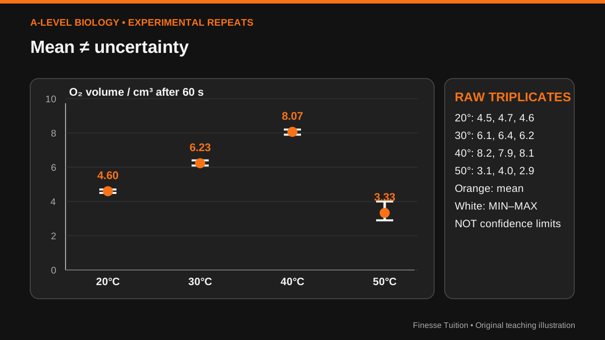
At 20 °C our three oxygen-volume readings are 4.5, 4.7 and 4.6 cm³; at 30 °C they are 6.1, 6.4 and 6.2; at 40 °C they are 8.2, 7.9 and 8.1; at 50 °C they are 3.1, 4.0 and 2.9. These values are synthetic, included only to practise handling a realistic kind of dataset.
For 40 °C the mean is (8.2 + 7.9 + 8.1) ÷ 3 = 8.0666… cm³, approximately 8.07 cm³. The range is 8.2 − 7.9 = 0.3 cm³. At 50 °C the mean is (3.1 + 4.0 + 2.9) ÷ 3 = 3.33 cm³ to two decimal places; the range is 4.0 − 2.9 = 1.1 cm³. That is noticeably more spread in these three readings.
The figure below shows mean values with min–max whiskers. These bars are ranges: they are NOT standard deviations, standard errors or confidence intervals. Without knowing the definition of error bars you cannot interpret them responsibly, and overlap or non-overlap of arbitrary bars is not an automatic statistical significance test. Ask what the graph displays before using statistical vocabulary.
The rate mistake that a tidy graph will not forgive
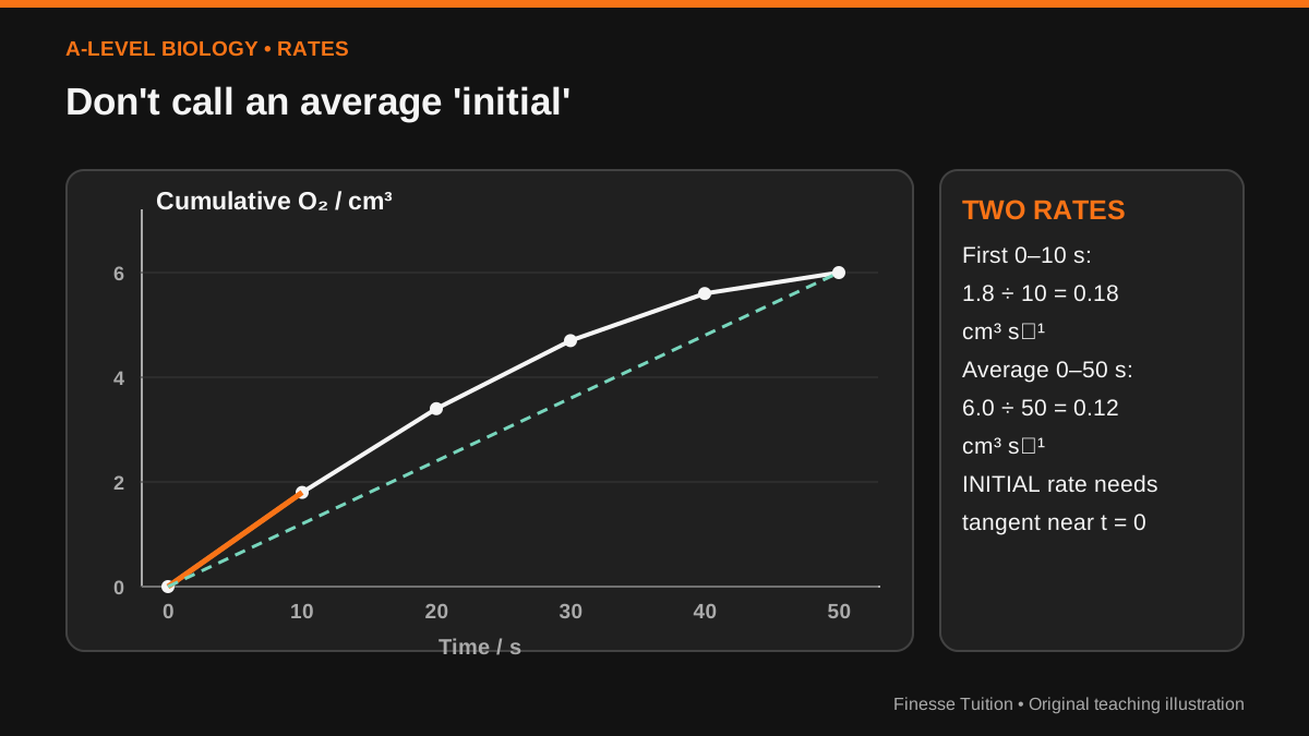
An oxygen volume collected after 60 seconds is an amount produced over an interval. It does not automatically give the INITIAL rate. Enzyme activity can change through the measurement as substrate is depleted or conditions drift. Dividing the volume after 60 seconds by 60 gives an average production rate over that interval, which may be different from the early gradient.
Imagine a separate, illustrative time-course at one temperature: time in seconds 0, 10, 20, 30, 40, 50; cumulative oxygen volumes in cm³ 0, 1.8, 3.4, 4.7, 5.6, 6.0. Over the first 10 seconds the average rate is approximately 1.8/10 = 0.18 cm³ s⁻¹. Over the entire 50 seconds, 6.0/50 = 0.12 cm³ s⁻¹. The first is a rough early-interval estimate, not a mathematically measured tangent at t = 0.
If a paper asks for the initial rate from a continuous curved trace, draw a tangent at t = 0 or as close to the starting point as the recorded data permit and calculate rise over run from two points on that tangent. Label the units correctly. A strong answer distinguishes a tangent estimate of initial rate from a finite-interval average.
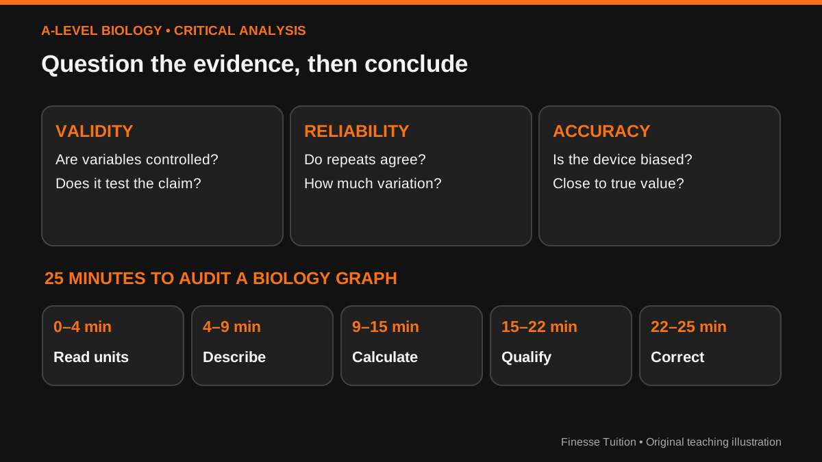
Validity, reliability and accuracy are not synonyms
Reliability concerns consistency of results when the procedure is repeated. At 50 °C, the spread of 1.1 cm³ across three illustrative repeats suggests looking more closely at consistency than for the 40 °C results. Repetition can help us estimate variability, but repeating a poorly designed measurement does not automatically make its inference valid.
Validity asks whether the method actually tests the stated causal question. If the enzyme concentration, pH or volume of hydrogen peroxide also changed between temperatures, a temperature trend might be confounded. Accuracy asks how close a reading is to the true value; a gas syringe that systematically under-reads could give closely clustered, repeatable yet inaccurate measurements.
Precision describes closeness among repeated readings, a related but distinct concept. When asked to 'evaluate' a practical, name the actual threat, explain how it affects the interpretation and propose a practical improvement. 'Use more repeats' is helpful only when you say what uncertainty those repeats address.
Build your conclusion in four sentences
Sentence one is a numerical observation: 'Mean oxygen volume at 60 s rose from 4.60 cm³ at 20 °C to 8.07 cm³ at 40 °C, then fell to 3.33 cm³ at 50 °C.' Sentence two relates it to the experimental question: 'The highest mean measured among these four temperatures was at 40 °C.'
Sentence three supplies a plausible biological explanation while respecting the data: 'This pattern is consistent with increasing catalase-catalysed activity up to a region near 40 °C and lower activity at 50 °C; structural change to the enzyme could contribute.' Sentence four explains a limit and a next experiment: 'To estimate the temperature optimum more closely, test additional temperatures around the peak with independent repeats and monitored pH.'
Do not say that the bar chart proves the precise optimum is exactly 40 °C. Do not write 'significantly different' unless appropriate statistical evidence has actually been calculated or supplied. Don't call an observation of less oxygen 'proof of denaturation' without evidence distinguishing mechanisms.
Practise critique through retrieval and feedback
The Education Endowment Foundation's metacognition guidance (second edition, 2025) recommends embedding planning, monitoring and evaluation strategies within real subject tasks. Here that means planning which data to inspect, monitoring whether a claim outruns its evidence, and checking the final answer against specific marking criteria. Its 2021 feedback guidance stresses the importance of giving learners an opportunity to act on feedback.
Dunlosky and colleagues' 2013 review found strong general evidence for practice testing and spacing compared with relying on rereading alone. Those findings do not amount to a trial proving this four-pass graph routine improves A-Level Biology grades. Turn them into something you can evaluate personally: critique one unseen chart without notes, correct the specific reasoning errors, and repeat on a different dataset a few days later.
If a question is hard because you lack underlying biology, learn the mechanism with correct examples before drilling graph critique. Retrieval without accurate initial teaching is not a substitute for knowledge.
A 25-minute evidence audit
Take a genuine practical-data question from your exam board. Cover its explanation and mark scheme. Move from observations to cautious interpretations before checking your response. The minutes are a workable suggestion, not a universal formula; with a full six-mark question, spend longer if needed.
- 0–4 min: copy axes and units and define exactly what each plotted point represents.
- 4–9 min: describe the pattern numerically, then note one limitation.
- 9–15 min: calculate a mean, range or gradient with units; inspect replicate information.
- 15–22 min: write a conclusion, a plausible mechanism and a controlled follow-up.
- 22–25 min: self-mark, write the cause of the lost mark and schedule an unfamiliar dataset two or three days later.
What counts as evidence—and what doesn't
The data above were invented to practise reasoning, not to estimate catalase's true temperature optimum. Different enzyme preparations, concentrations and conditions can give different outcomes. A graph is only as meaningful as its axes, measurement procedure, replicates and scope.
Uncertainty does not mean that you cannot conclude anything. It means making the strongest claim the measurements justify and no stronger. That disciplined language is central to the practical and analytical skills recognised in A-Level Biology examinations.
Sources & further reading
- AQA A-Level Biology (7402): official practical assessment and maths requirements
- AQA A-Level Biology (7402): official specification
- EEF (2025), Metacognition and Self-Regulated Learning
- EEF (2021), Teacher Feedback to Improve Pupil Learning
- Dunlosky et al. (2013), review of effective learning techniques
Sources checked on 12 October 2026. Check linked guidance for subsequent changes.